
Cursive Letter R Worksheets
Cursive r looks nothing like the printed r, and treating it as the same shape is what makes it hard. Big model, the capital with it, rat, run and red, and a sentence to end on.
Curated by  Poppy Fox
Cursive R Sentence
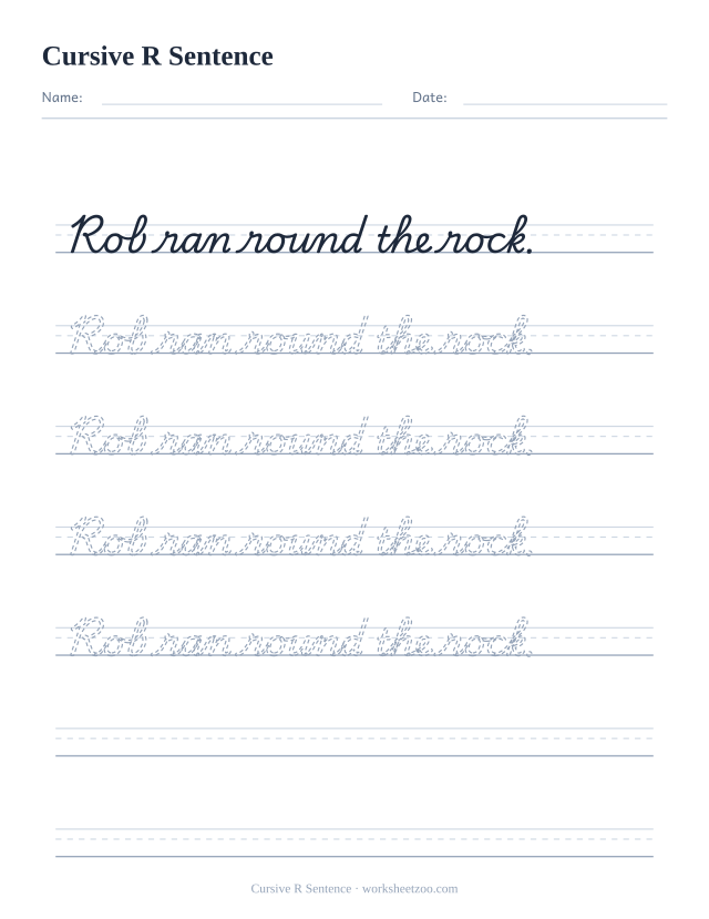
A whole sentence to trace and then copy: Rob ran round the rock. Joining letters inside real words is the step single letters cannot teach.
Download PDFCursive r looks nothing like printed r, and pretending otherwise is what makes it hard. Run the undercurve up from the baseline to slightly above the midline, then flatten out into a short horizontal shoulder, make a small point or dip, and come straight down to the baseline before exiting forward. There is no arch and no bowl anywhere in the letter.
The shoulder sits above the midline
Two details decide whether an r is readable. The first is height: the shoulder rises a little higher than n and m do, so r pokes up slightly above its neighbours. The second is the flat top: if the shoulder curves over instead of running flat, the letter becomes an n, and words like rat and run stop working. Teach it immediately after n so the contrast is fresh.
Why the shape changed
Print r has a vertical stem and a small arm. Joined r evolved from a different medieval form and kept a shoulder and a dip instead, because that shape can be entered and left without lifting the pen. Telling children this directly helps more than it sounds: once they stop expecting the printed shape, the cursive one is easy to accept and quick to learn.
What you get in the download
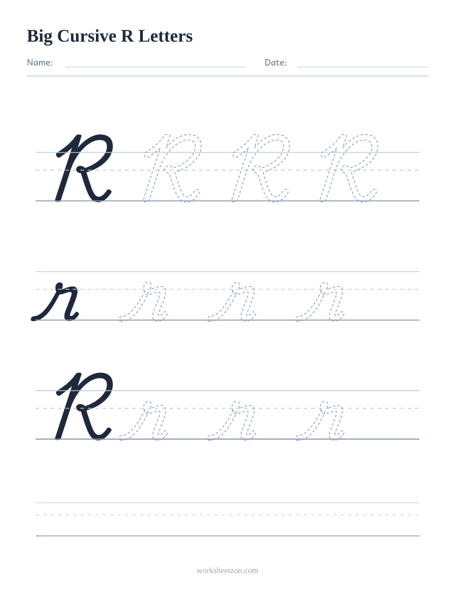
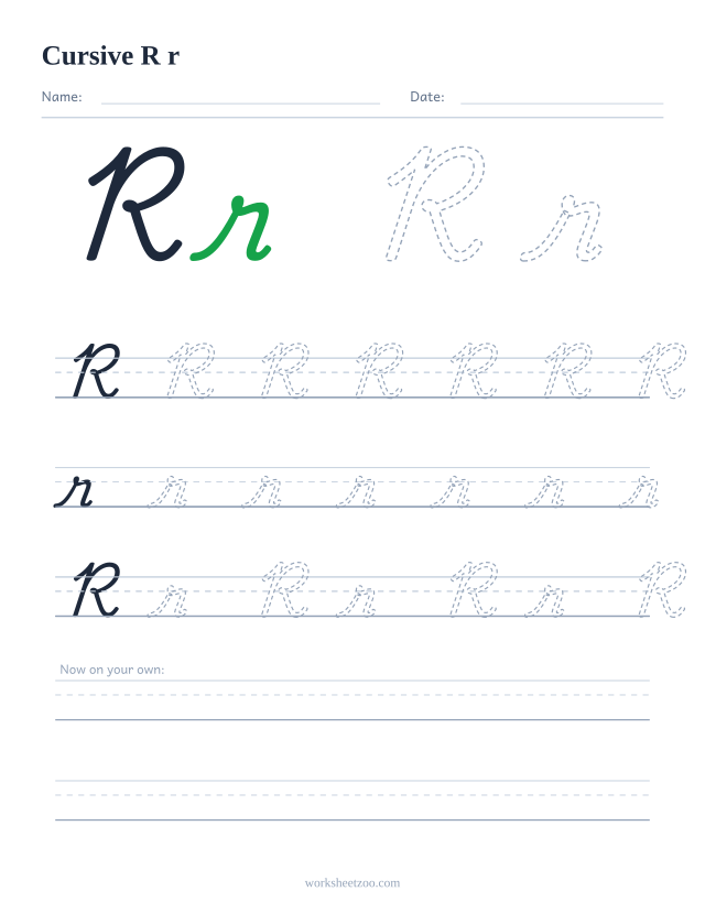
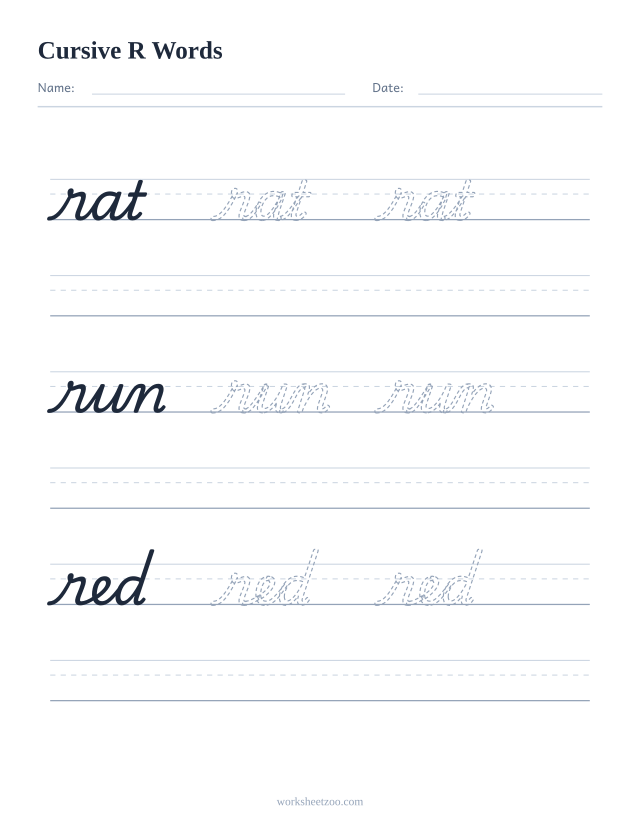
The extra large page prints R and r at a size where the flat shoulder is obvious, a solid model followed by three dashed copies on each of three bands, with a free ruled band at the bottom. The guided page shows the pair at 96 point, then rows of seven capitals, seven lowercase and four Rr pairs on three line guides, before two ruled lines. The words page traces rat, run and red.
Why does cursive r look nothing like printed r?
Because it descends from a different historical letterform, one shaped to be written without lifting the pen. The joined version keeps a flat shoulder and a small dip where the printed version has a stem and an arm. It is one of three lowercase letters, with s and z, whose cursive shape a child cannot guess from the printed one.