Cursive Letter N Worksheets
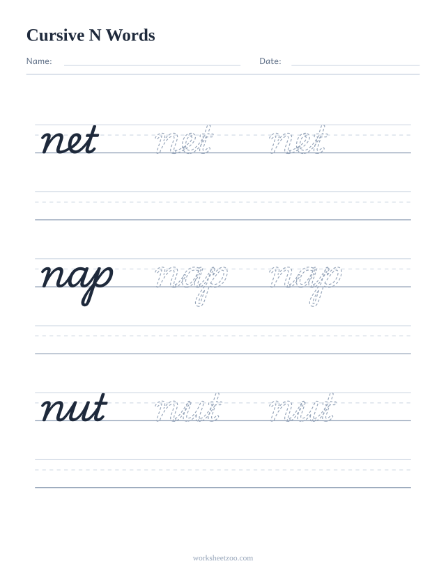
Cursive n is m with one hump removed, which is why the two get confused on the page. Do this page straight after m: big letter, pair, net, nap and nut, sentence.
Curated by  Poppy Fox
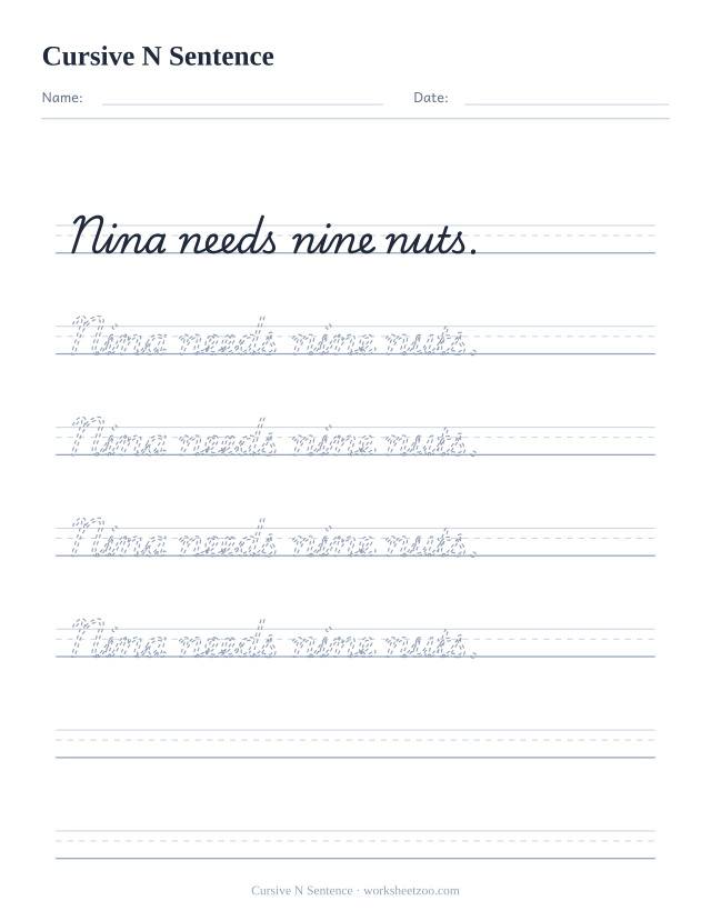
Cursive N Sentence
A whole sentence to trace and then copy: Nina needs nine nuts. Joining letters inside real words is the step single letters cannot teach.
Download PDFCursive n is two downstrokes joined by one rounded arch. Enter with an overcurve from the baseline, arch over to the right, come down to the baseline, arch over once more, come down and exit forward. It is the same motion as m with one repetition removed, and it is one of the most frequent letters in written English, so it repays early attention.
n and u are the same shape upside down
Cursive n arches over the top; cursive u dips under the bottom. That is the only difference, and when a child's slant is inconsistent the two letters genuinely become hard to tell apart in running writing. The diagnostic is the join: n hands over from the top of a downstroke, u hands over from a valley. Writing nu, un, nun and uun on one line makes the contrast obvious quickly.
Keep the arches round and the sides parallel
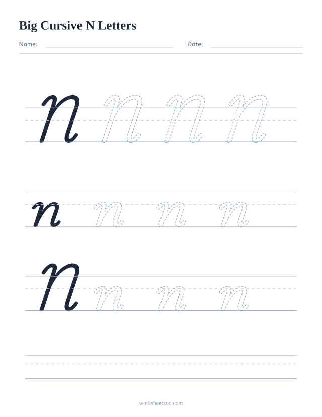
Pointed arches are the usual fault and they come from turning the pen with the fingers. The second usual fault is width: a narrow n crowds against the next letter and a wide one opens gaps in the word. On the guided sheet the model n at the start of each row is the reference, so compare the last n on the line against the first rather than against an idea of what n should look like.
What the sheets include
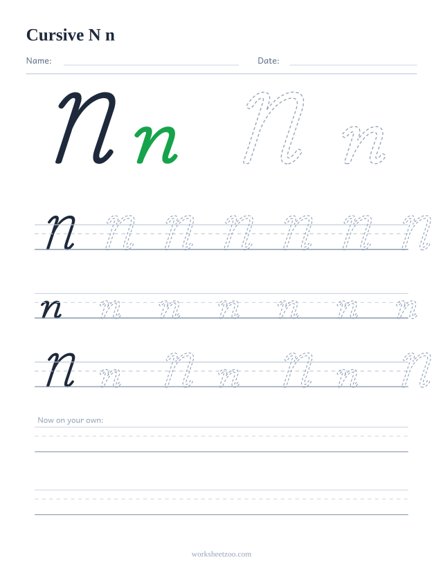
The extra large page carries N and n at 88 point, with a solid model then three dashed copies on each band and a free ruled band at the bottom. The uppercase and lowercase page demonstrates the pair, then runs rows of seven capitals, seven lowercase and four Nn pairs on three line guides, closing with two empty lines. The words page traces net, nap and nut.
How do I tell cursive n from cursive u?
By where the curve sits. n curves over the top of each downstroke and u curves under the bottom, so n looks like two arches and u looks like two valleys. In fast handwriting the difference narrows, which is why keeping a consistent slant matters more for these two letters than for almost any others.